Fly UX Start-up Airline App
Overview
The client was a start-up airline called Fly UX. They were looking to create an online experience that was fast, easy and intuitive. The task was design a new app with focus specifically on the flight booking process. How users search for, find and select flights online was investigated and the research gathered was turned into a working prototype.
Scope & Constraints
This project was apart of my Professional Diploma in UX Design. Therefore, there were limitations in what data could be collected. There was also a six month time limit on this project with the estimated deadline of March 2021. Within this time scale, there were monthly deadlines to meet so the project remained on track.
Research.
01. Competitive Benchmark
To begin, 4 competitor apps; Easyjet, Trainline, Wizz Air & Ryanair were reviewed in order to:
- Understand the conventions.
- Highlight best practices that could be emulated.
- Identify issues that could be resolved.
Key Insights
Homepage: Apps order the functions in which you would use them during your flight experience, putting the booking function first (most visual) and tracking your flight last.
Search and select: The apps and websites have an emphasis on modification throughout the booking process based on cost. For example, you're not just given the times and costs for the dates you searched for, it gives you the option to play around with the dates in order to get the cheapest deal.
Entering details: Entering personal details are left to last where all apps and websites ask for an account to be created. Card detail all have to be added manually.
02. Online Survey
After the competitive benchmarking was complete, an online survey was designed to take no more than 5 minutes to complete.
A total of 62 responses were received which provided very useful quantitative attitudinal data.
Key insights:
25% of respondents found it took a little or a lot more time to find what they were looking for on their last visit to a airline or flight comparison website/ app.
Qualitative data indicates that finding out about baggage options and searching for the correct dates took the longest amount of time, making it a more frustrating process.
Majority of respondents prefer purchasing plane tickets through an airline website or app.
03. Usability Testing
Next, there was a need to find out how users got on using competitor apps. Usability tests were conducted to learn their goals, behaviours and context. A recruitment screener was used to select appropriate users for a usability tests and an in depth interview. During the usability tests, the participants were asked questions about their experience booking flights online as well as being asked to perform tasks on competitive airline apps and websites:
Positives
Overall, the display and layout is clear and understandable.
Pain Points
Fare options were difficult to understand and choose between. ''There's a lot of reading, I don't know if I'd bother proceeding''.
Users were unsure if the flights they'd selected were the best or cheapest. ''Once I've looked at both flights, I'd start again to see if I could get it cheaper''.
Observations
When selecting dates, the software wasn't as forthcoming with how many days and nights had been selected.
Users went through the flight search process at least twice to check they had found the cheapest flight.
Define.
04. Affinity Diagram
An affinity diagram was created to organise all the research data gathered. So, myself and a colleague collaborated by writing down points and notes gathered during research on post-it notes and stuck them on a wall. We then sorted through the post-it notes to organise the data into some insightful categories.
05. Customer Journey Map
Alongside the affinity map, a customer journey map was created to review each step the customer would take through the booking process. Goals, behaviours and pain points were noted down for each step which allowed stages that need improving to emerge.
Design.
06. User Flow Diagram
In the design stage, the objective was to fix the issues identified during the affinity diagram session and the creation of the journey map.
A user flow diagram was used, focusing on the primary use case.
07. Designing Screens
Using the user flow diagram as guidance through the interactions, low-fidelity screens were sketched out, along with remarks on what each screen would contain. This process helped test the validity of the designs before moving on with the design process.
Prototype.
08. Medium-fidelity Prototype
Once each screen had been sketched out, a medium fidelity prototype was created using Figma.
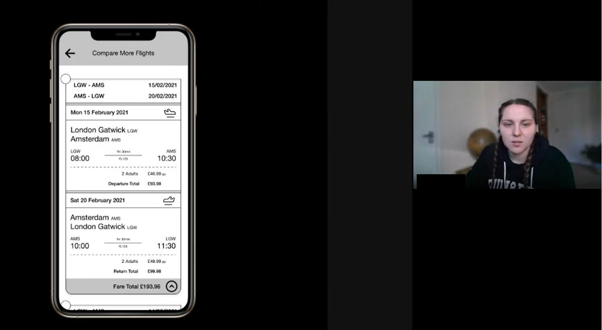
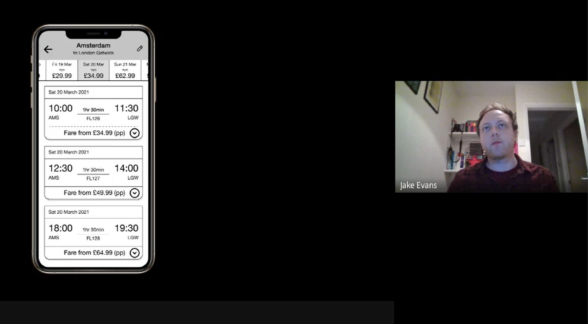
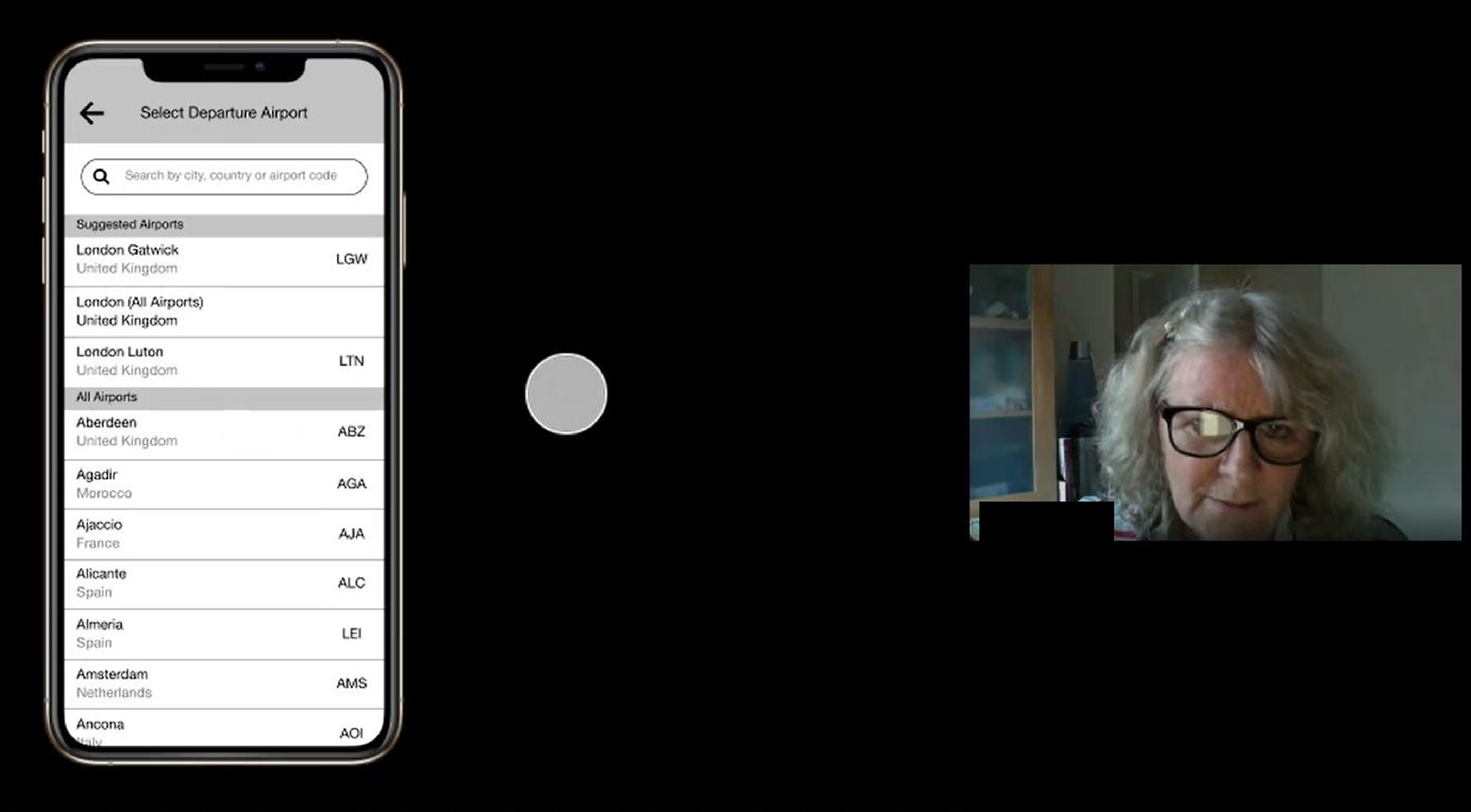
09. Prototype Usability Tests
Usability tests were conducted on the the prototype to:
- Test the concept and flow
- Test the screen layout and hierarchy
- Test the basic interactions from searching for a flight through to payment
- Test the navigation
Conducting these usability tests created rich qualitative data and provided the below key insights
- Some of the touch points were too small and were difficult to navigate.
- When comparing different flights, users couldn't remember what their original flights were so found it difficult to know if the new flights that they were looking at were more suitable.
- Having cost variables such as additional luggage placed later in the booking process rather than at the point of selecting flights frustrated the users.
Build.
Test.
Final Prototype Testing
As a sanity check, further usability testing was conducted to validate the modifications made during the medium-fidelity prototype stage.
