Overview
Soho Skin is a new brand soon to be launched this year under the Soho House Umbrella. Marketed as a new self care range with natural ingredients and designed with Soho House members in mind.
As apart of this launch and promoting the brand, a series of emails were required in order to make Soho House members aware and to sell the new range of skin care products.
Scope & Constraints
For the Soho Skin unveiling, a number of emails had to be built and sent out to customers prior to product release and inline with the websites launch.
Just like any brand launch, the project had to be constrained to the wider direction of the brand and its identity.
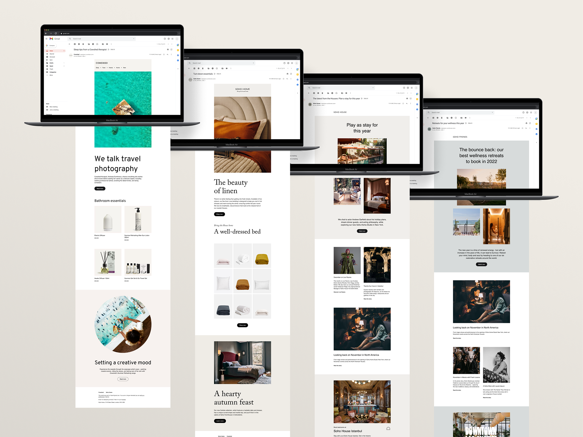
Three type of emails were required to be built from scratch; product announcement, editorial and automation.
Research.
To begin with landscape research was carried in order to find out what we were competing with, to understand best practice and finally to see what we could do better.
Afterwards, analysis and exploration was carried out to see what existing components in our library could be used or altered to suit Soho Skin.
Email Design.
Over 12 weeks, several rounds of iterations were created until 3 themes emerged and became the styles that were taking through to sign off.
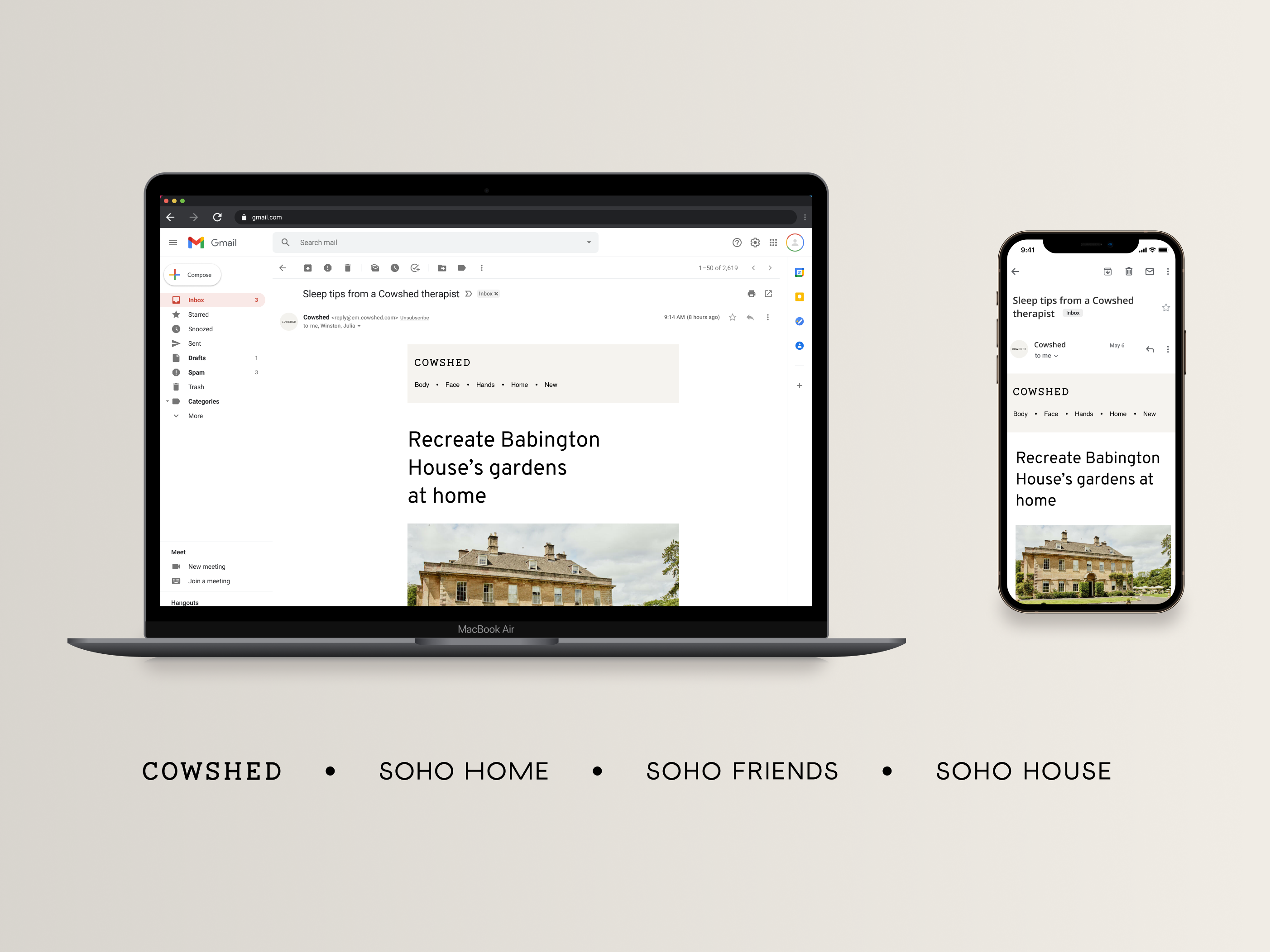
Once the designs were finalised, technical considerations were taking into account such as a users email client. An alternative typeface was chosen as well as a fallback just incase the original or alternative typefaces were not compatible.
UI elements such as CTA hover states and text link underlining were finalised as this stage aswell.
Design System
New emails are to be sent out each week so a structured design system was required that allowed users across departments to use without needing to know any extensive Figma knowledge.
Each component was created using a master component as well as sub components that made up each master component so that any amendments or alterations could be made quickly and pain free.
These components also needed to be built so to aid developers a spacing guide was created to give clarity to how each component should look.
9 master components make up the emails of this brand which create a total of 65 sub components
Build.
User acceptance testing was carried out and recorded so that what was being built matched what had been designed. This was important not only for structure and spacing but also for UI element such as CTA hover states and text link roll overs.


